This book proposes that description is one way to design, reproduce and enable access to things. Between October 2016 and December 2017, Will Holder will recall and describe hundreds of tiny material decisions made in response to a specific context of past collaborators’ work.
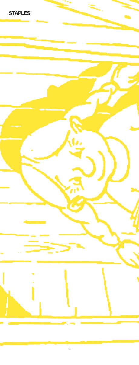
STAPLES! proposes that description is one way to design, reproduce and enable access to things. Between October 2016 and December 2017, Will Holder will recall and describe hundreds of tiny material decisions made in response to a specific context of past collaborators’ work. For example:
STAPLE, steel (not stainless), twenty pieces. Bik Van der Pol’s expansive “research” – and its relations to imperfect representations of a collective past – resulted in the proposal of a series of sixteen-page, black and white stapled booklets (wrapped in a full-colour image section, and coloured paper cover printed in black ink) edited by Lisette Smits and published, when needed, to accompany work. Editorial and design decisions towards an imagined 240 page, glued book could be discovered, learned from, and adapted, piecemeal. This process would be visible to the reader. This five-year series of publications was considered ‘too complicated.’ Nevertheless the proposed model was maintained, and came to represent an alternative, but rejected past. The short-term responsiveness of the stapled booklets’ designs vs. a glued book’s long-term significance became hypothetical.
Raddraaier, the printer, passed on the binder’s advice to stagger the staples at different heights along the booklets’ spines, to minimise bumps.
Bik Van der Pol, Past Imperfect, Casco Issues No.9 (ed. Lisette Smits), Casco, Utrecht / Revolver, 2005. 978-3-865882-18-9.
STAPLE It is suggested that the widespread adoption of the staple was instigated by the nazi’s demonstration of its potential for dissemination. Along with DIN standards – staples were described by Jan Tschichold as “the devil’s work.”
Christopher Burke, Paul Renner: the art of Typography, Hyphen Press, 1999. 978-0-907259-12-1
— —
STAPLES! is out of print.
Produced as part of NO Sorry! We Don’t Do REQUESTS at Kunstverein, Amsterdam, 2016; and Propectus: A Year with Will Holder, at KW Institute for Contemporary Art, Berlin, 2017. With thanks to CAC Vilnius for support.
a